


Line is the Building Block of All Things Visual
Line is the simplest, most common, and possibly most effective element of design. It almost feels silly to mention it until you realize the power that lines contain, so let’s talk about why lines are important in design, marketing, and branding. Spoiler: They aren’t just for making oxford shirts more slimming.
Over the next 8 weeks or so, I’ll be taking a deep dive into the various elements and principles of design so that YOU can use them to benefit your design skills, connect with your audience more effectively, and have YOUR designs be the talk of the town.
To see the other posts in the series, follow this link.
Why is Line a Principle of Design?
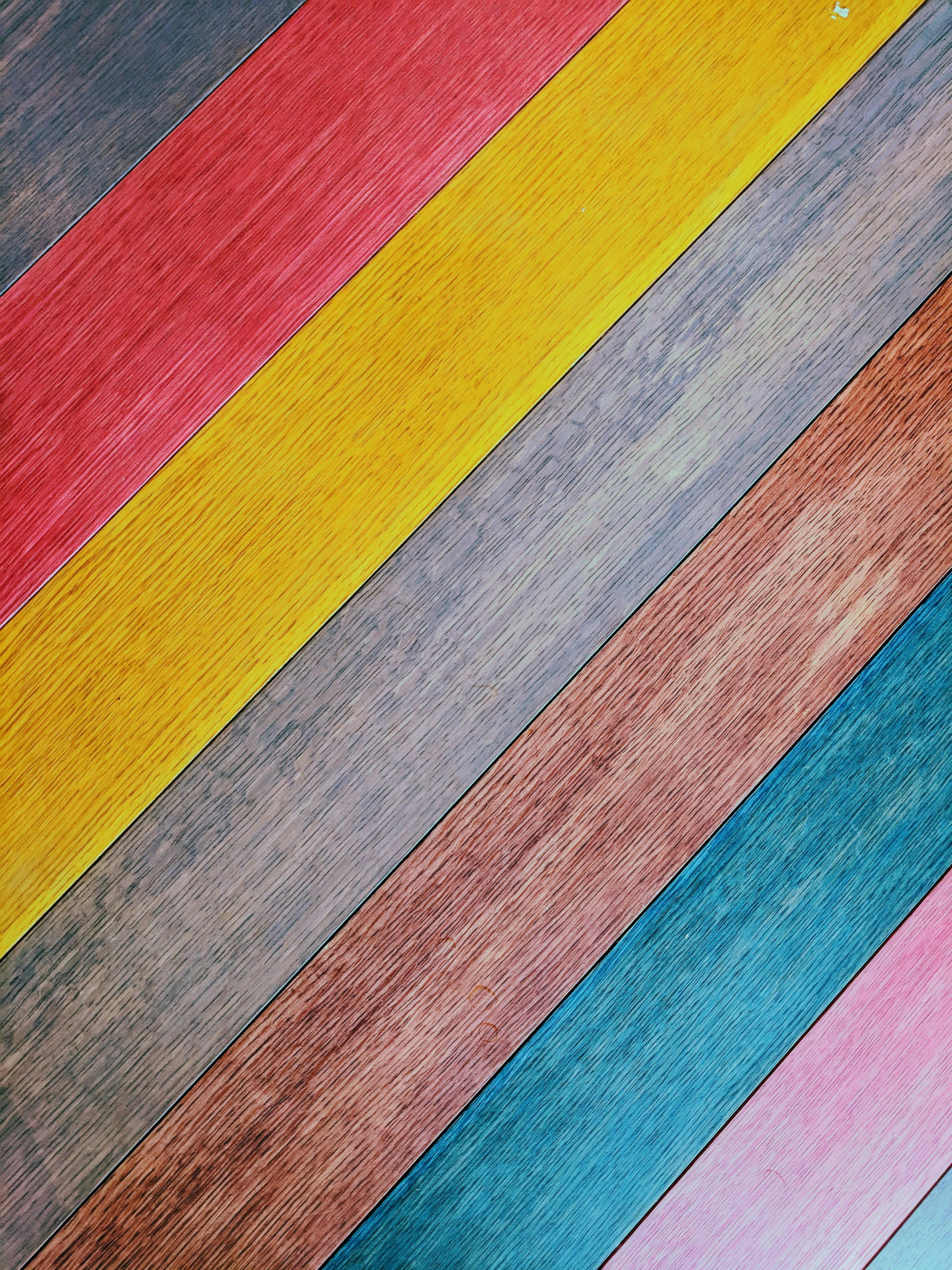
Lines give us the ability to delineate what we see. As such, the ability to discern lines is baked into the human psyche, allowing us to recognize what we see in the world around us. Because of this close relationship with brain function, line is perhaps the most fundamental aspect of design, allowing photographers, artists, and designers to better control what is seen in their work and in what order. In terms of design, lines serve innumerable functions, but let’s dive into a simple example in the image above.
What are the lines in this photograph doing? The first thing I notice are the diagonal lines separating the wood panels by color. So, we could say that lines are used to divide elements, which allows us to better understand what we are looking at in the photograph.
The next thing I notice are all the smaller lines making up the wood grain of the boards. These lines help us to understand what the panels are made of and give it texture. Lines can be a great way of adding depth or texture to a design.
Finally, and perhaps most importantly, is that the lines contained in the above image are providing a sense of direction that guides the viewer’s eye across the photograph, allowing for an easy entry and exit point to the image.
One of the most important aspects of design is guiding the audience toward important information with an understanding that people have short attention spans. When designing a flyer or advertisement, it is critical that the designer guides that attention toward the most critical information first.
With this in mind, let’s look at another example:

What did you see first in this image? Take another look. Where did your attention go first? What path did your eyes follow as you looked at it?
If you’re like me, you saw the tower at the top first, then followed a zig-zag pattern leading downward through the photo. Another person might start at the bottom and work their way upward, but the lines leading up or down the staircase are impossible to ignore.
Let’s look at another example that is a little more abstract:

We are hitting a point with technology where I’m genuinely unsure if this is a photograph or a digital graphic, which is neat. I wanted to show this example because it combines the line’s abilities that I’ve already discussed.
In the image, the lines direct attention through the image, create texture, increase visual interest, draw dividing lines, and generate rhythm (more on that in another blog post coming soon!).
How Does This Connect to Design, Marketing, and Branding?
If you’ve been following along this far, you should know that lines are instantly recognizable, are fun to look at, and —most critically—can guide attention.
Check out this advertisement from Coca Cola and notice the similarities to the photographs above:
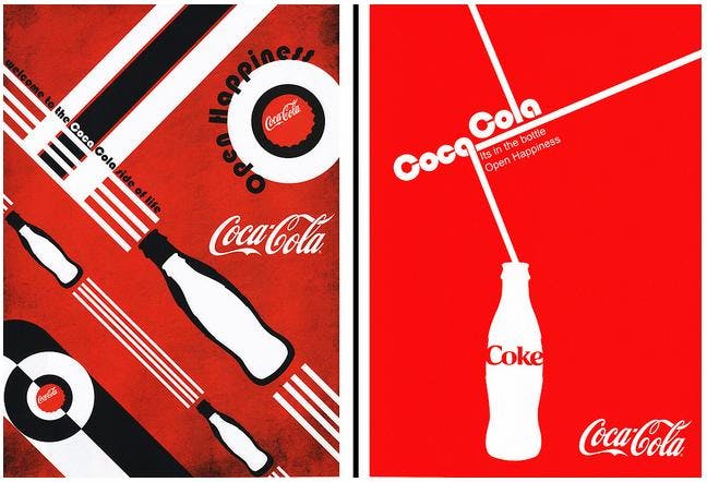
Source: Medium
This magazine spread uses lines to guide viewers’ eyes around an interesting composition, emphasizing the various branding elements.
I could go through several examples showing this off, but at this point you should trust that effective use of lines can help point your audience to your message.
Instead, let’s check out some line-based logos:
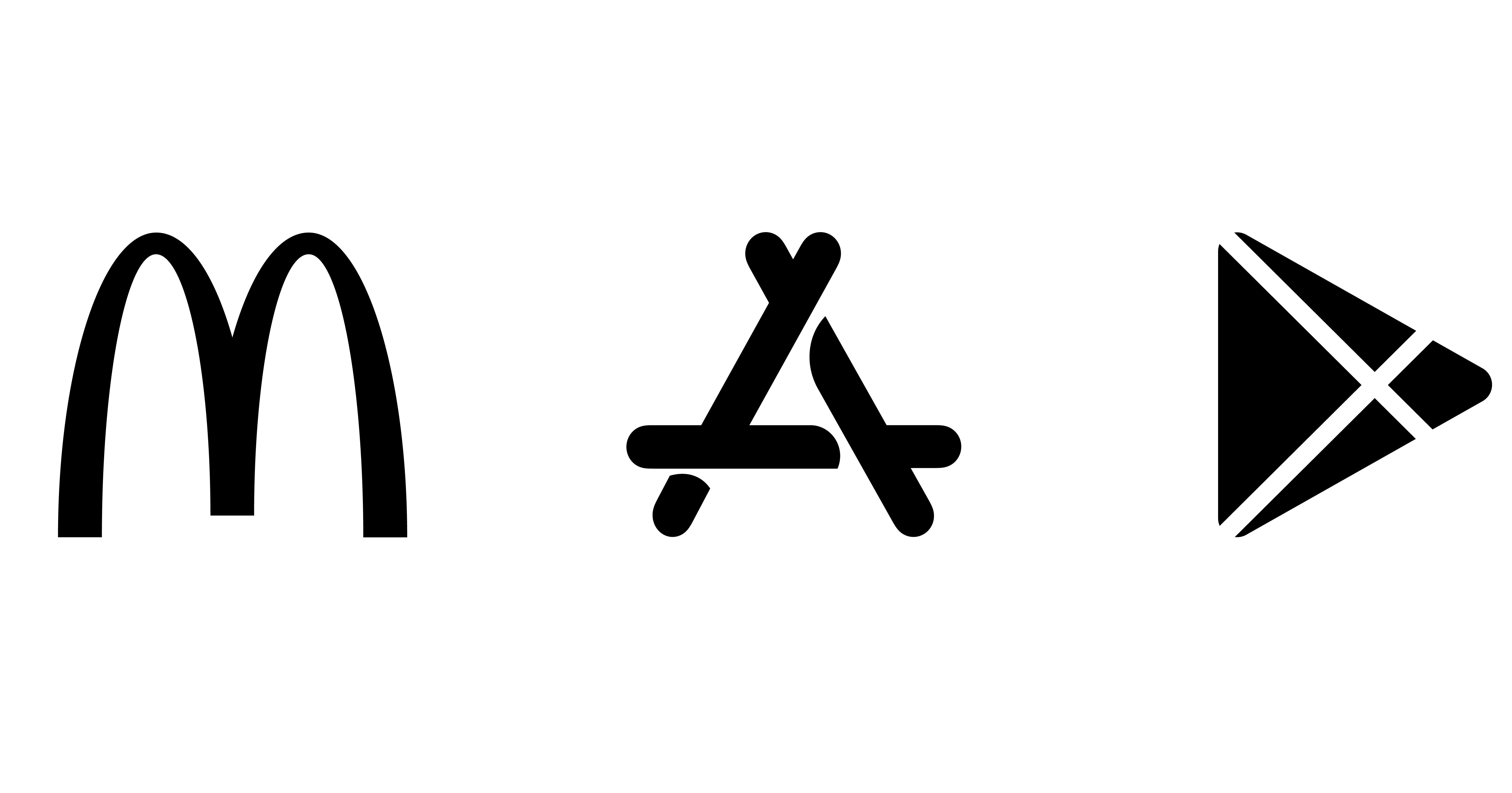
Even without their brand colors, these logos make expert use of lines to create instantly-recognizable markers for their businesses. Built on simple lines and curvature, they are easy to understand, memorize, and recall.
Thanks for Reading!
This explainer is really basic, but it provides a framework for the other posts in this series. I hope that you've learned valuable information that you can use as a small business owner, entrepreneur, or budding designer. Next week, I’ll be diving into the next-most-important aspect of design: Contrast.