

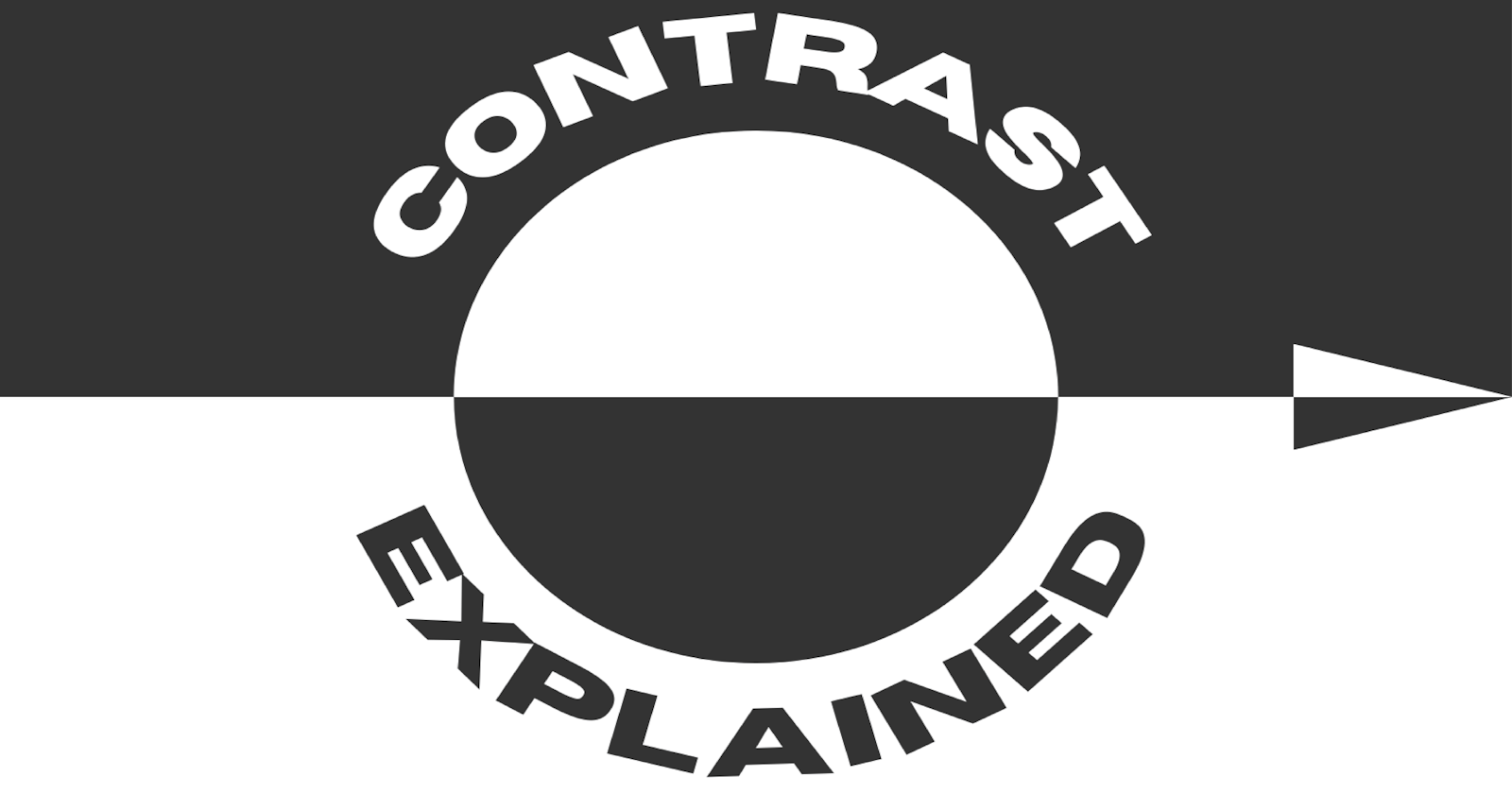


You can see the word contrast used in a variety of ways in the worlds of design, art, and photography. The word carries many definitions and meanings, so let's break down some of those meanings and how you can use it in your own work.
Contrast, for our purposes here, is defined as the difference or degree of difference between things having similar or comparable natures.
This definition doesn't do much to narrow it down, so here's how I like to look at it: Contrast is just a noticeable difference between two things. This noticeable difference makes it easier for us to compare, which is the critical element here.
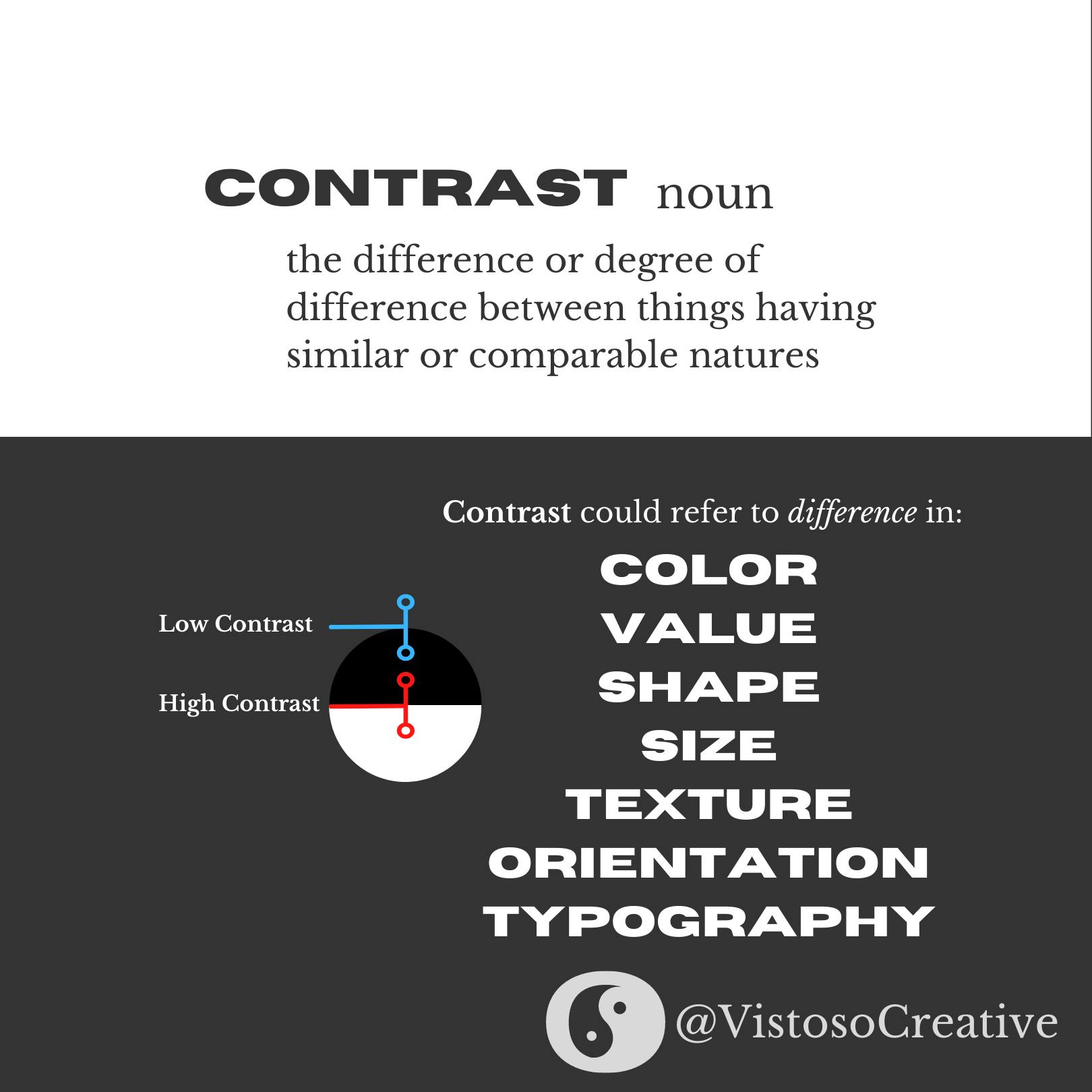
Contrast could refer to noticeable differences in color, value, shape, size, texture, orientation, typography, form, and so much more. Frankly, it is a concept that can be applied to nearly anything as long as it is a reasonable means of measuring difference.
Elements can be described as having "high contrast" or "low contrast", which refers to the degree of difference. As a simple example, black on white would have high contrast, whereas black on dark gray would have low contrast. You could apply the same logic to shapes, noting that a triangle on a circle has high contrast, whereas an oval on a circle has low contrast.
Why Does This Matter At All?
Thanks for asking, I appreciate that. The quick answer is that the concept of contrast is perhaps the most important principle of design to use if you would like to cultivate visual interest.
Visual interest is the bread and butter of design. It's that eye-catching factor that invites people to look at a design, a photograph, or another work of art. Contrast invites people to compare items and draw conclusions by giving them something to compare to. Put shortly, contrast gives the viewer something to notice and evaluate.
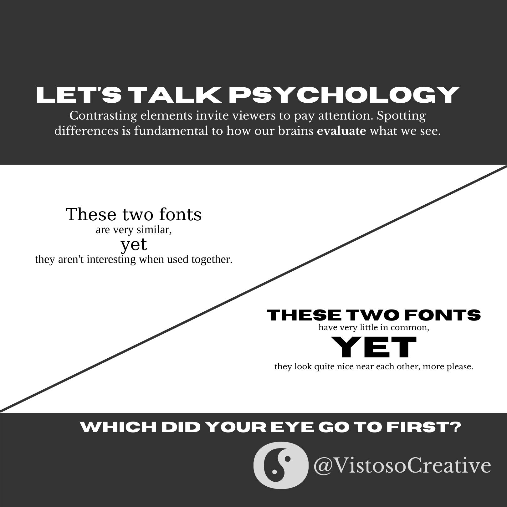
The image above is an example of typographical design which provides two examples of font pairings. In the upper left, the two fonts are very similar serif fonts that could be described as low contrast. The letterforms have a lot of similarities in their shapes, leaving few comparisons to be made, which leaves the composition looking boring or uninteresting. For a detailed breakdown of how to choose fonts or font pairings, click the links!
In the bottom right font pairing, there are two fonts present which have many contrasting elements. The top font is presented in all caps, has a very heavy line weight, and is sans-serif. The paired font is much daintier, has serifs, and is not capitalized. The result is a pairing that is engaging and interesting because we are able to evaluate the differences between the two subconsciously.
Okay, Contrast is Important. What Are Some Ways to Use It?
You are asking all the right questions today, and I appreciate your interest this far! Running back through our list from earlier of places where contrast applies, let's talk first about color.
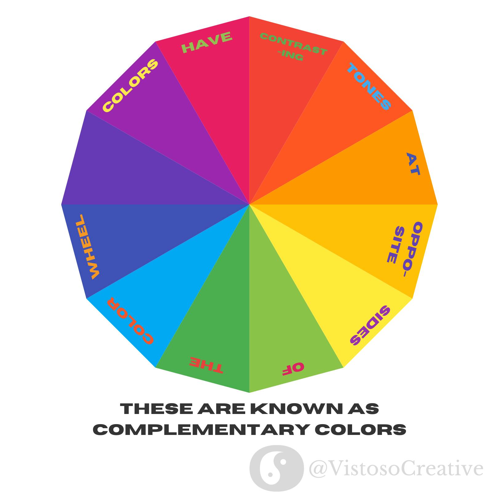
Colors at opposite ends of the color wheel have maximum contrast to one another and are known as complementary colors. I'd like to state quickly that maximum contrast is not always the desired effect. For example, when working with type, maximum contrast can make things difficult to read in some instances, causing things to appear to be vibrating.
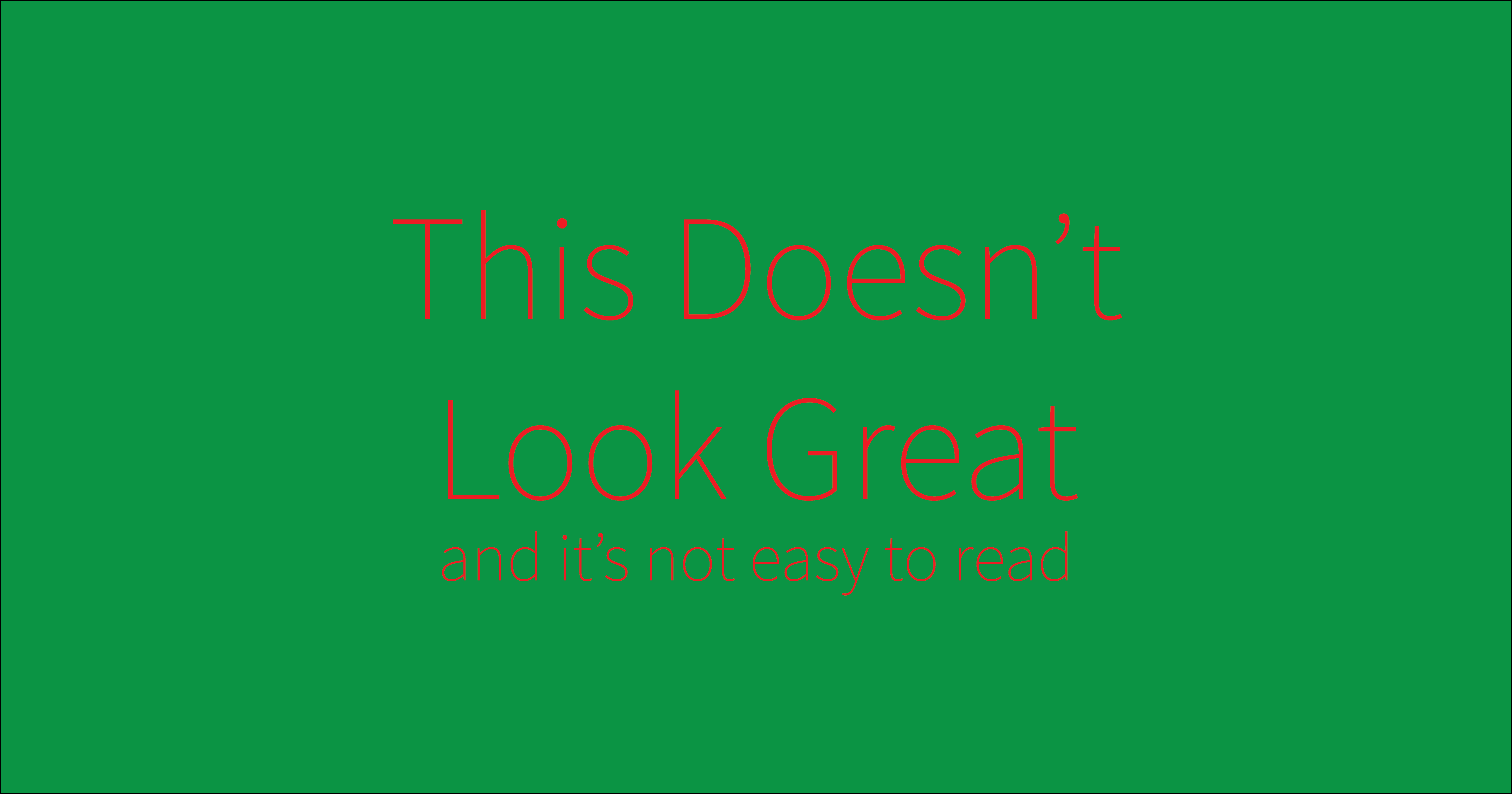
However, the color wheel can be a good frame of reference for contrast and an easy trick to rectify the issue above is to change the value, or the shade, of the colors, which will make them easier to read.
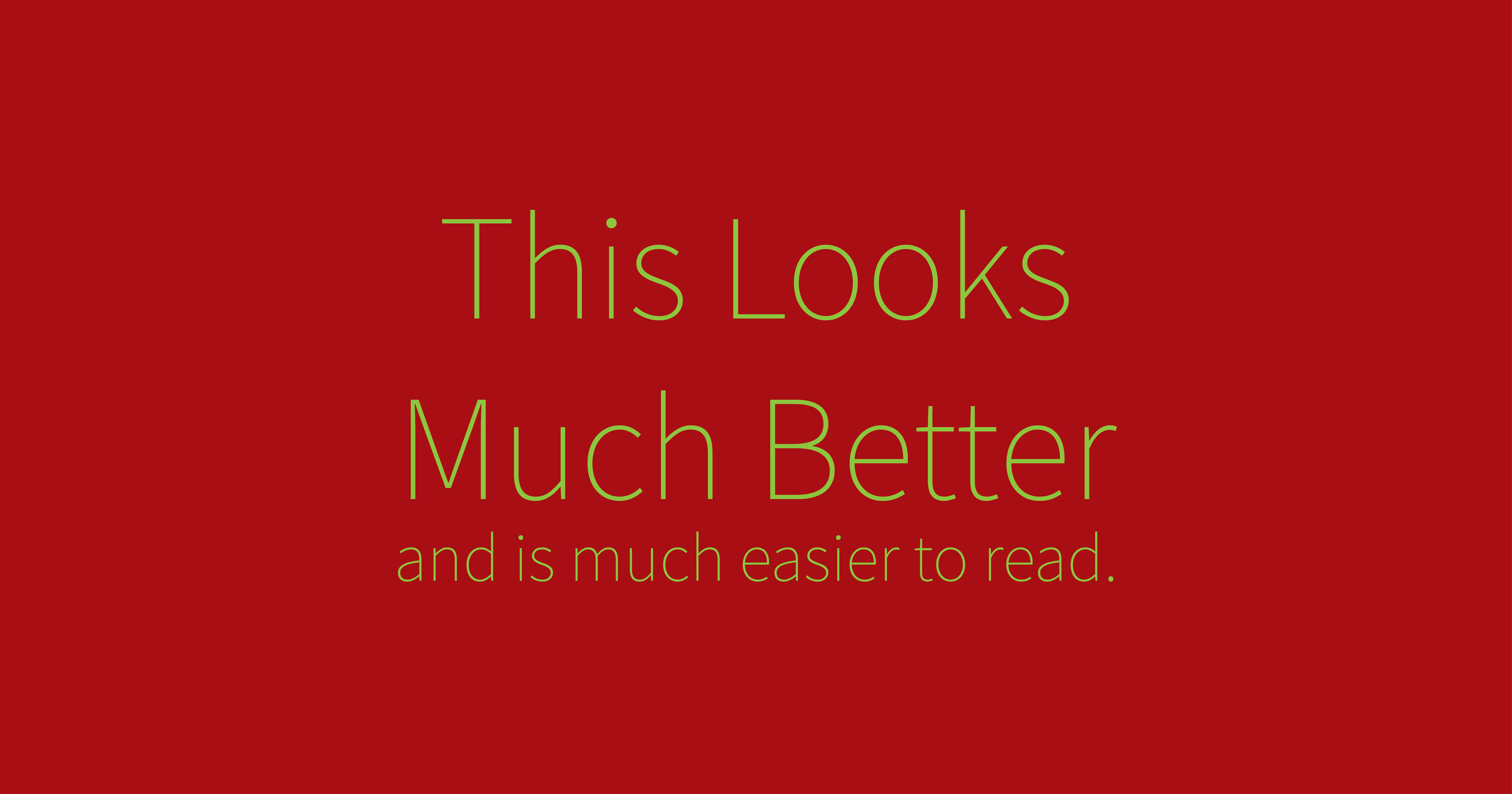
By using a darker red and a lighter green, the contrast between the two is easy to spot, but the text is much easier to read.
So, you could say, that contrast in color is better expressed between the colors' values rather than hues.
Extrapolation
Contrast is a concept that can be extrapolated to just about anything, meaning the possibilities are endless! There are truly innumerable ways to make your designs more interesting, but here are a few more examples that have been used by designers and artists for centuries.
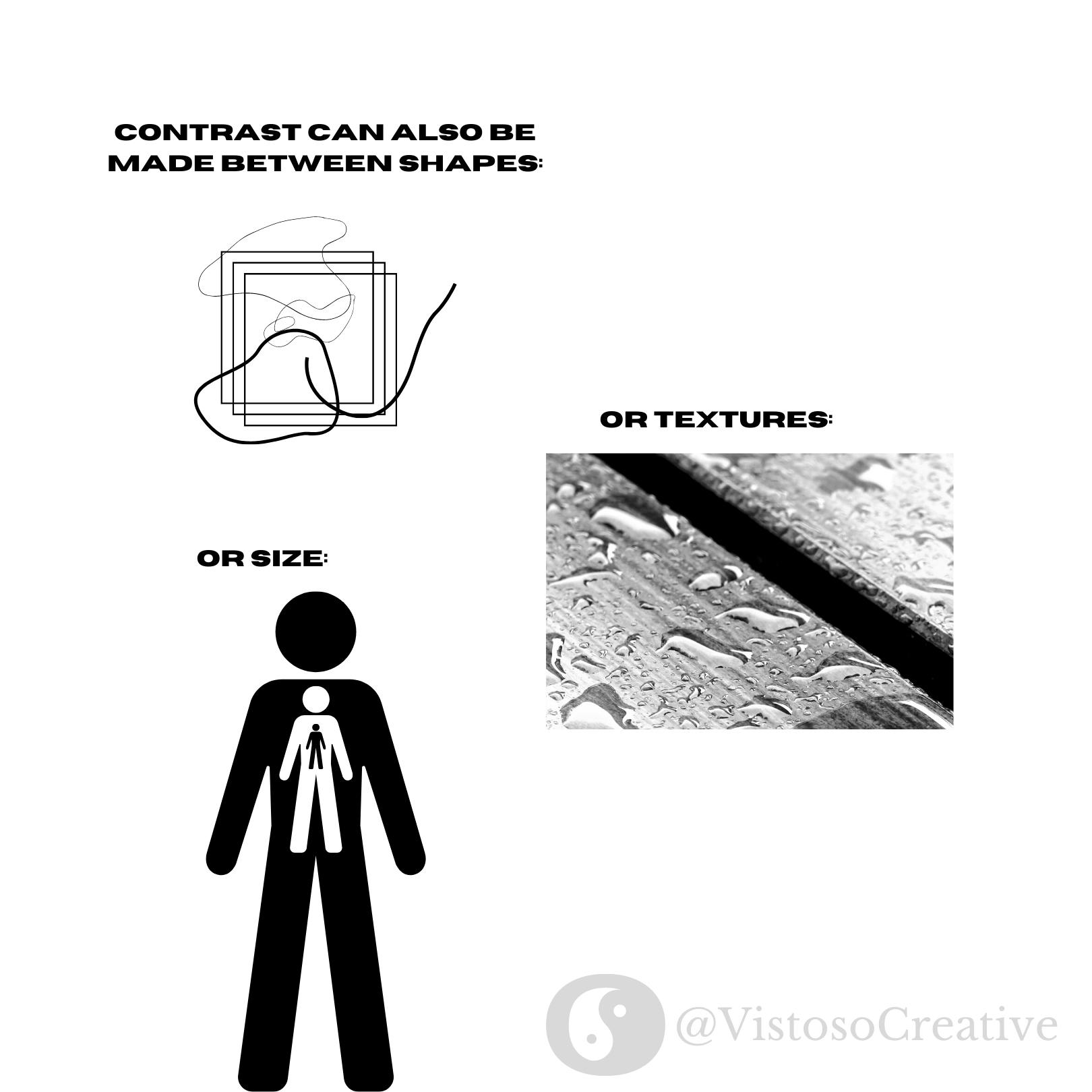
As I previously mentioned, contrast can be made between shapes. Having rounded elements near sharp, angular elements can bring interest to both, allowing the viewer to notice the differences between the two, and as a result what makes them special.
Textural contrast can be created as well, as exampled by the second photograph. The picture is interesting to look at because there is a distinct difference between the texture of the water droplets against the hard grains of the wood beneath it. We are able to easily distinguish what we are looking at.
Size can also be an impactful method of using contrast. Placing small elements near large ones can imply a sense of perspective or depth while simply making a composition more interesting to look at.
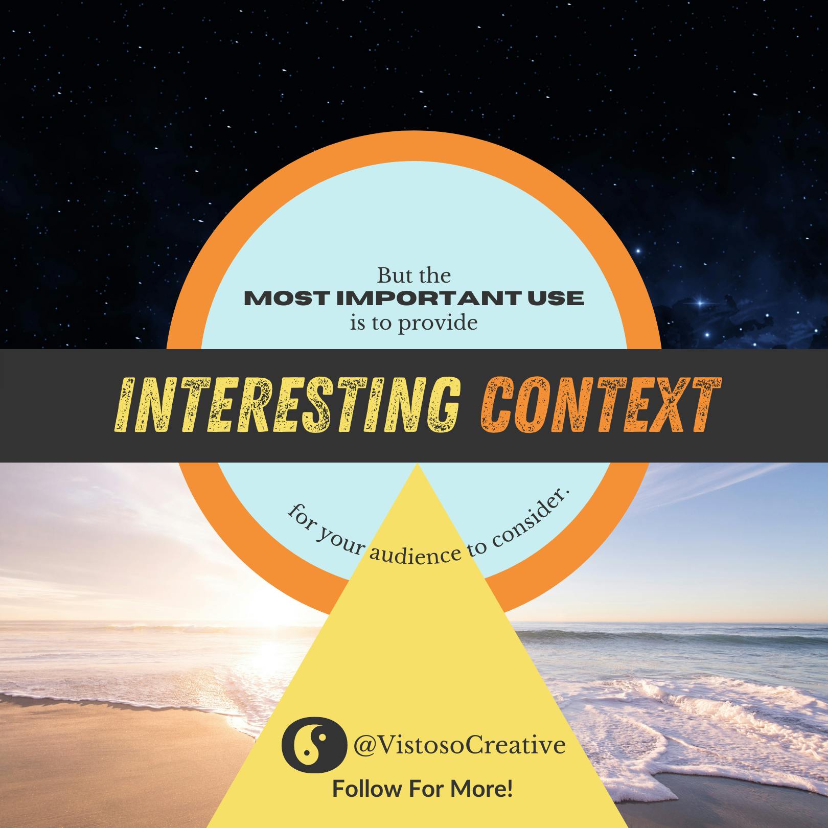
If there's one takeaway that you should hold onto from this presentation, it's that contrast provides context that allows your audience to evaluate what they see, which means you have their attention.
With that, how will you use contrast to drive your message home? The possibilities are endless, but the simple fact is that contrast is critical to interest. With clever use, you will command attention and ensure that your message is heard.
Thanks So Much For Reading!
If you have any questions, comments, or feedback, please leave them below!